DIGITAL
DIGITAL SYSTEM
OVERVIEW
Sway is a new digital point of sale system that is similar to square and clover, but also has a backend system that organizes its’ clients inventory and seamlessly integrates into their daily operations.
OBJECTIVE
The objective was to create a cohesive brand identity for sway that would be versatile and applicable to both online and print applications. It needed to be easy to read and reflect company values; easy, effective, intuitive, organized and streamlined.
RESULT
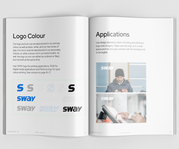
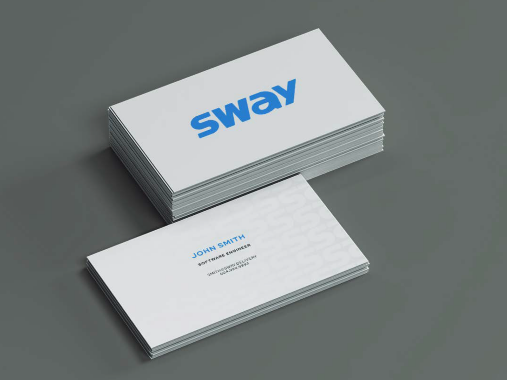
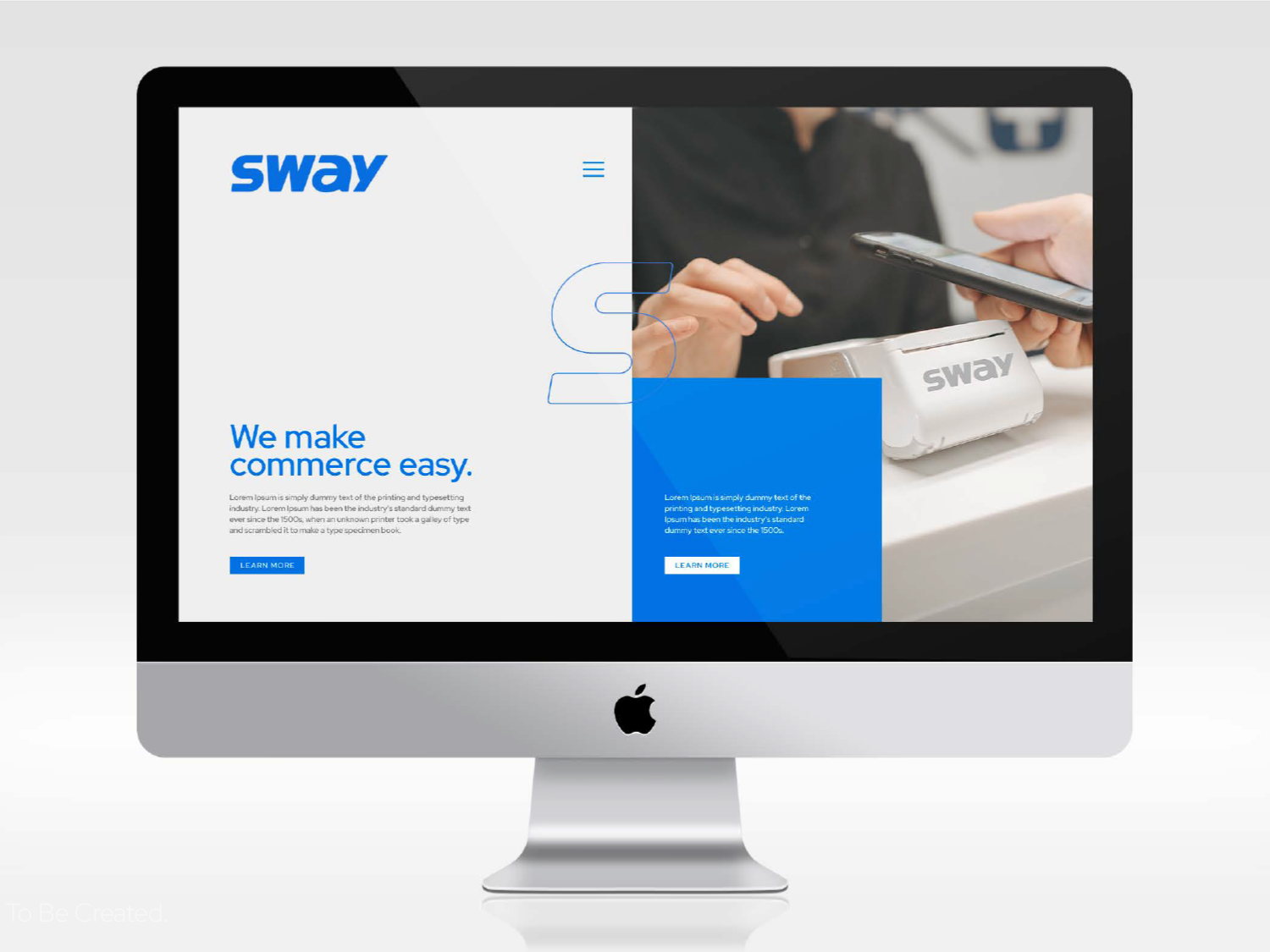
The Sway wordmark was designed to be simple and legible to remain effective in a wide range of applications, from small logos to murals, to in-app displays.
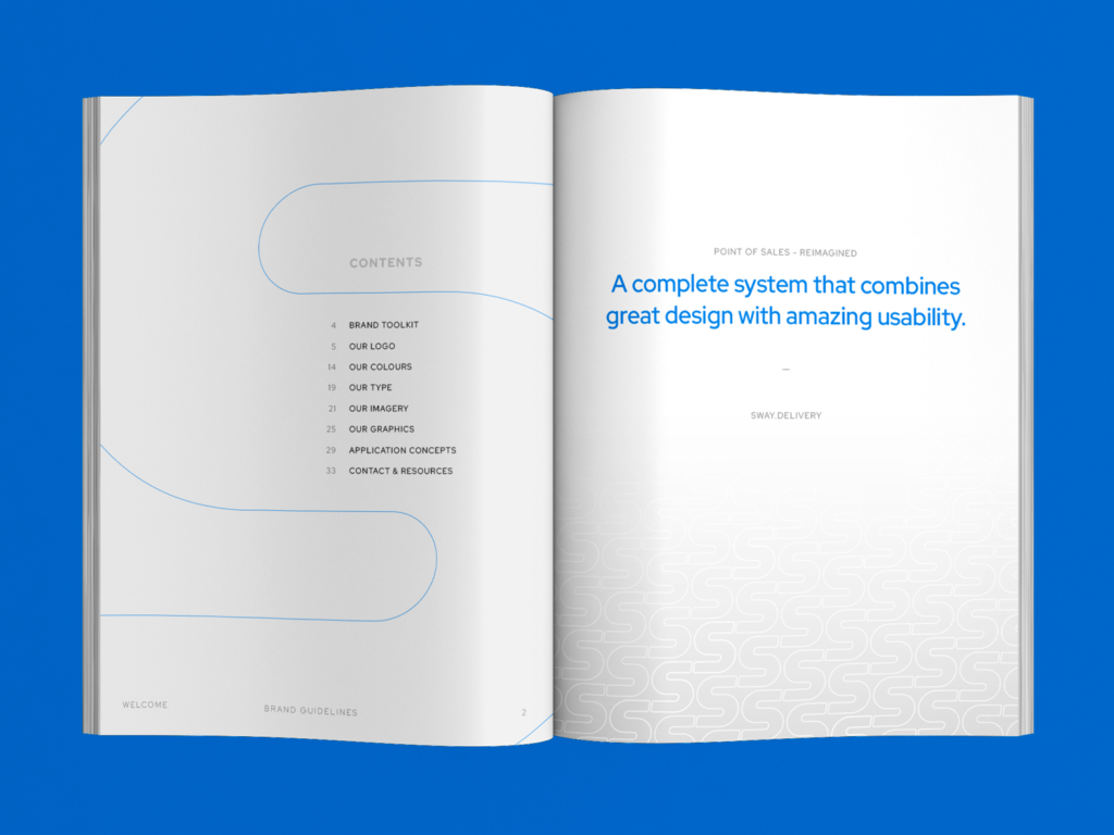
Additionally, the “S” from the wordmark is used in patterns, as well as the super graphic; visually showcasing the exchange of service from one destination to another.
![](https://www.onbrandagency.ca/wp-content/uploads/2024/04/sway-book5.png)
![](https://www.onbrandagency.ca/wp-content/uploads/2024/04/sway-book4.png)
![brand book layout design of tech company in Vancouver](https://www.onbrandagency.ca/wp-content/uploads/2024/04/Mockup-WEBSITE_sway-brand-identity-mockup-vancouver-layout-design.png)
![](https://www.onbrandagency.ca/wp-content/uploads/2024/04/s-graphic-pattern-1024x768.png)
![](https://www.onbrandagency.ca/wp-content/uploads/2024/04/business-cards-example-1024x768.png)
![](https://www.onbrandagency.ca/wp-content/uploads/2024/04/sway-digital-website.png)