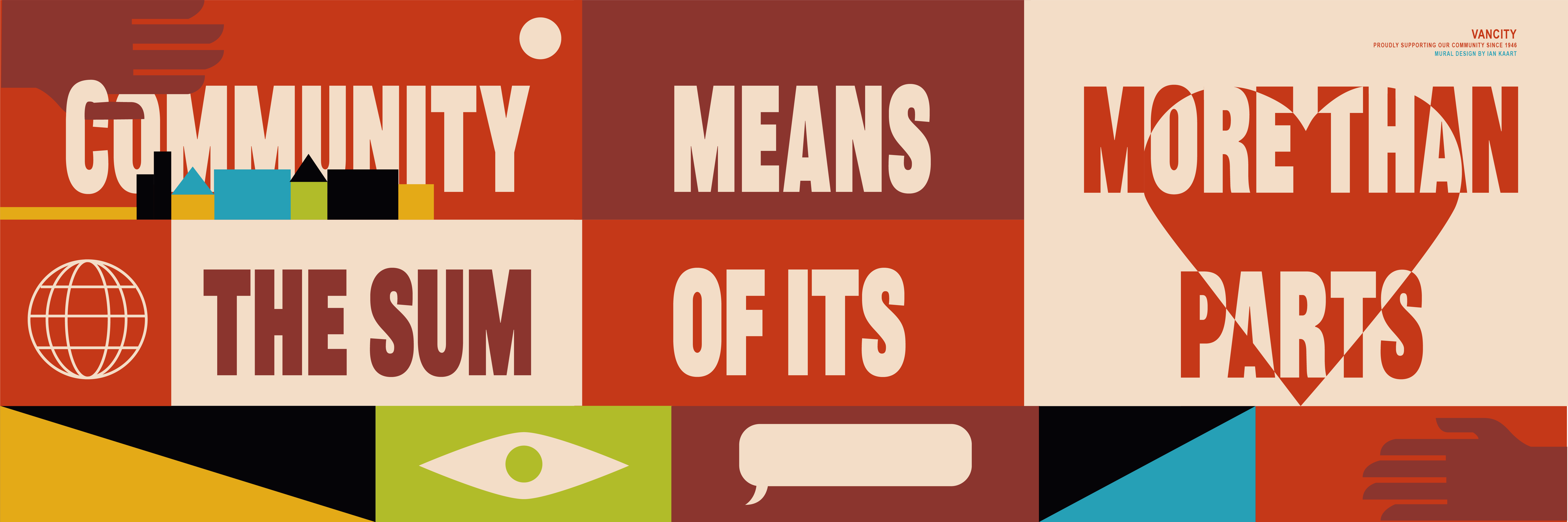
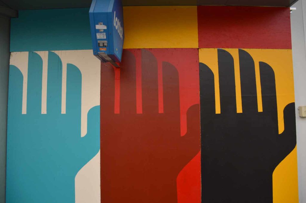
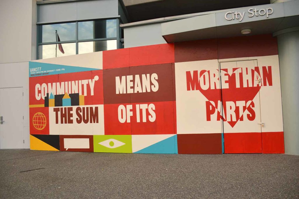
Vancity had to board up their headquarters during the pandemic and needed an installation that kept their headquarters recognizable until they could re-open to the public.
OBJECTIVE
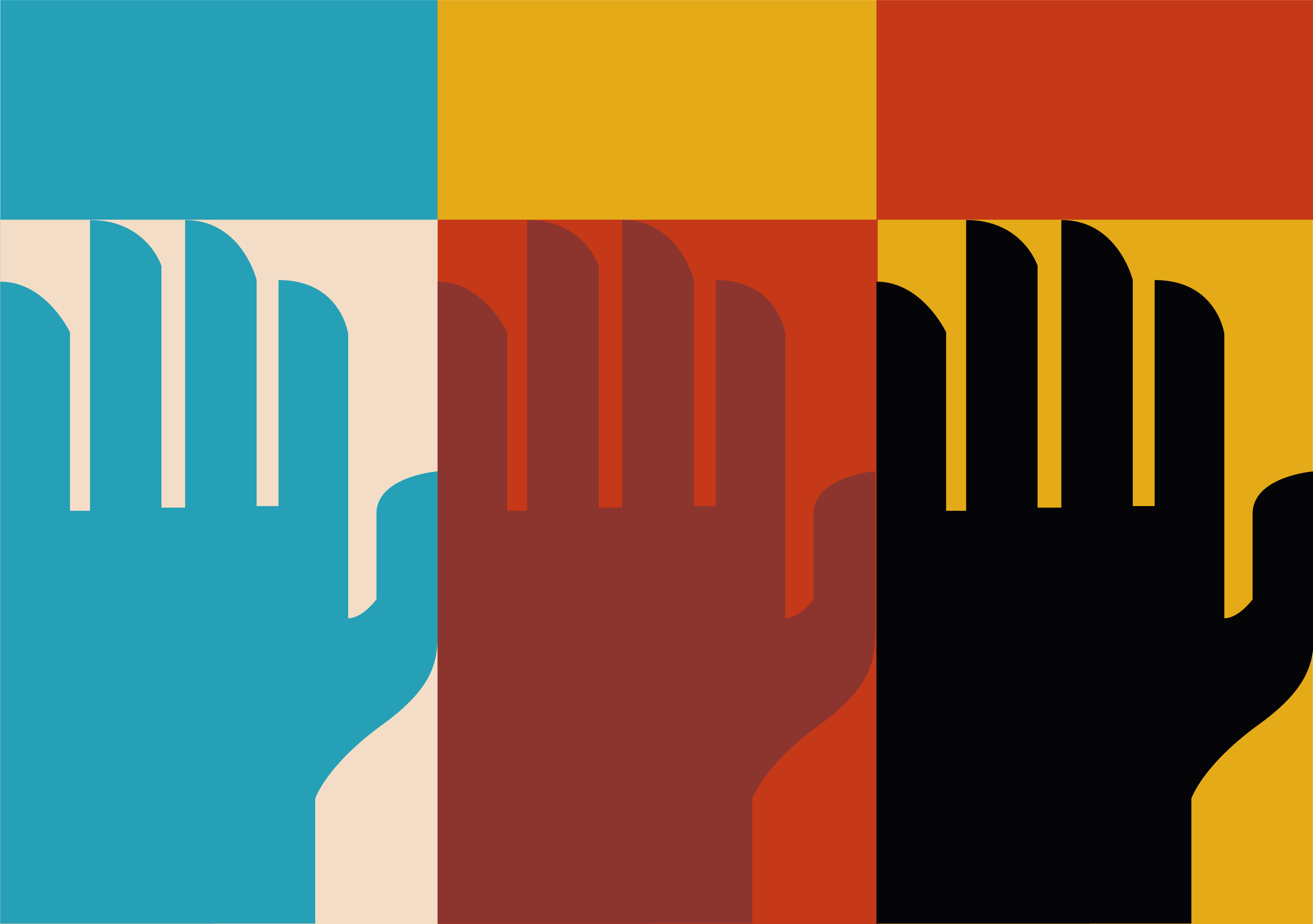
Our objective was to create a mural design that reflected a positive message to the neighbourhood while staying on brand with colour and shape.
RESULT
We created a bold mural design that reflected a positive message to the neighbourhood while staying on brand with colour and shape. We illustrated symbols to represent common traits that people of a community have to exercise in order to collaborate and connect with one another. Within the design we created a statement that reads “Community means more than the sum of its parts.” The message rings true in banking as well as how a community functions as a whole.